Thermals overview
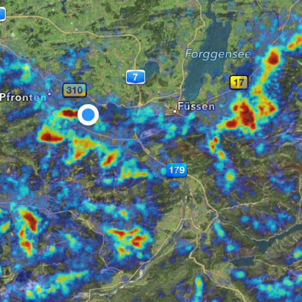
The overview of thermals in large-area regions where thermals can be found with high probability is visualized by a layer that is put on top of the maps.
The data required for producing an overview of thermals have been calculated and are provided by Michael von Kähnel. For the calculation flights from various servers and databases worldwide are being analyzed. The data is not only analyzed for potential locations but also with respect to time. This results in different datasets for the months January, April, July and October. Based on this time distribution the yearly trend of the probability of finding thermals in various regions can be shown.
 The data is furthermore divided by the time after sunrise. This results in datasets for each mentioned month at 4 hrs,
7 hrs and 10 hrs after sunrise at the calculated locations.
The data is furthermore divided by the time after sunrise. This results in datasets for each mentioned month at 4 hrs,
7 hrs and 10 hrs after sunrise at the calculated locations.
Regions with a low probability of finding thermals are shown dark blue, regions with a high probability of finding thermals are shown dark red. Between these extremes the color gradient changes from blue, over green and yellow to red. Regions in which hardly any thermals can be found are not colorised.
The visualization of the probability to find thermals can be especially used to get an overview of thermally active regions over a large area. For small-area regions the visualization of hotspots is usually more useful.
In the preferences for the map visualization the overview of thermals can be activated. There, also time related filters can be set. When using Apple maps also the transparency of the thermals' layer can be set.
The data of the thermals can either be stored on the iPad or downloaded when required from the server. Also these parameters can be set in the preferences.
Remark: The visualization of thermals shows only the probability to find thermals in various regions but does not indicate the strength of these thermals!